What is the project?
The Paul Hastings public-facing website is often used to inform clients about upcoming events hosted by the firm.
Key goals
Marketing department employees post new events to the website regularly. They often add their own custom HTML, which causes inconsistency in branding and poor displays on mobile devices.
Users have difficulty performing simple tasks, such as registering for events and viewing event agendas. Clean up the existing event pages to optimize for mobile, and users can easily access event information.
My roles and responsibilities
- Usability review, visual design, sketching, HTML prototypes, and front-end web development.
Team
I worked with the product owner and one back-end developer.
Duration
This effort took a total of 2 weeks to complete.
Work environment
I worked on-site and collaborated with our product owner, who was located in the New York office.
My process
Analyze
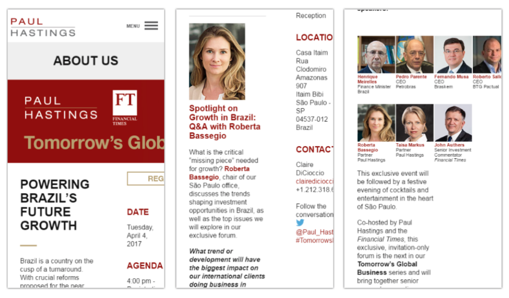
I interviewed the product owner and performed an assessment of the current event page, and observed the following issues:
- The page content was overflowing outside of the viewport, causing horizontal scrolling.
- The registration button and other CTAs were hard to find and were not large enough for fat fingers.
- The text on the page was too small, making it difficult to read.

Design
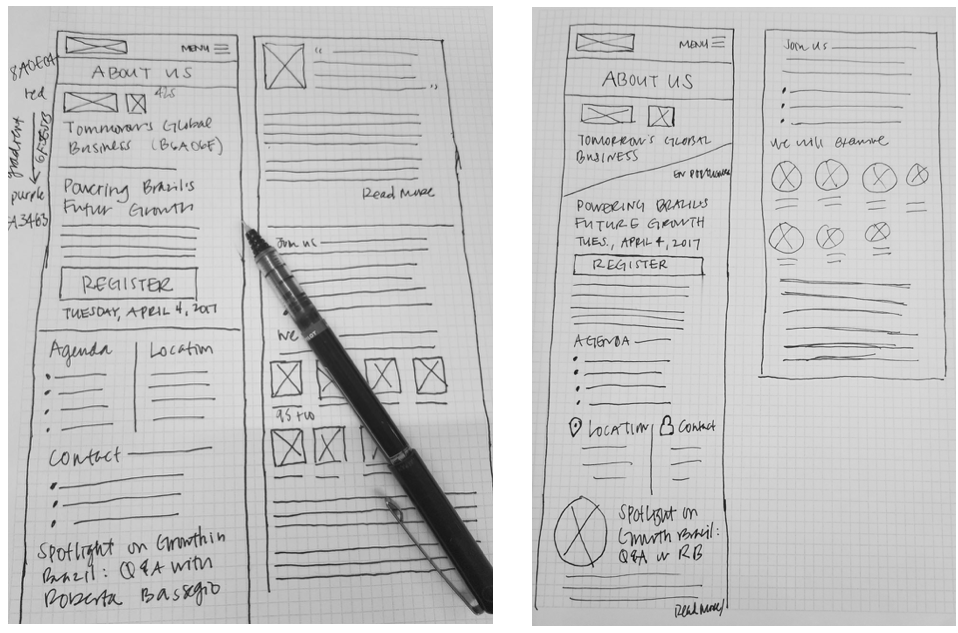
I started with sketches to get my ideas on paper.

Due to the fast-paced nature of the project, I went from sketches to HTML prototypes. After the Product Owner signed off the prototypes, I integrated the HTML markup with the content management system and created a template.

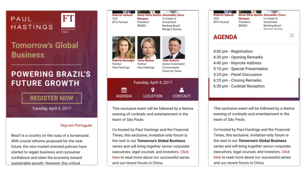
I made the following changes to address some of the issues I observed while assessing the old design.
- Moved the call-to-action (CTA) for event registrations to the top section of the page.
- Made the CTA larger to accommodate “fat” fingers.
- Displayed the date of the event near the registraction CTA.
- Fixed the horizontal scrolling on the page by using a grid layout for the presenters pictures and titles.
- Made the CTAs for viewing the agenda, location, and contact information more prominent by using the same gradient backgroud as the top section of the page.
- Displayed the date a second time to make it easier for users to retain this information.
- Used a modal for users to easily view the agenda and location details.
Results and lessons learned
Results
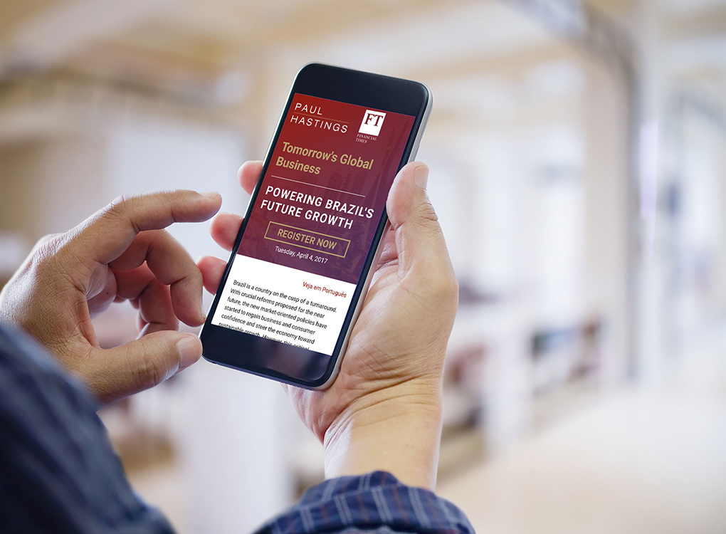
I was able to use my responsive design skills and knowledge of usability guidelines to streamline the page’s design and make it easier for users to register for the event on their mobile devices.
Leasons learned
If I had more time, I would have worked with the marketing team to decrease some of the text on the page. I also would have considered alternative layouts and performed usability testing to validate my assumptions.
