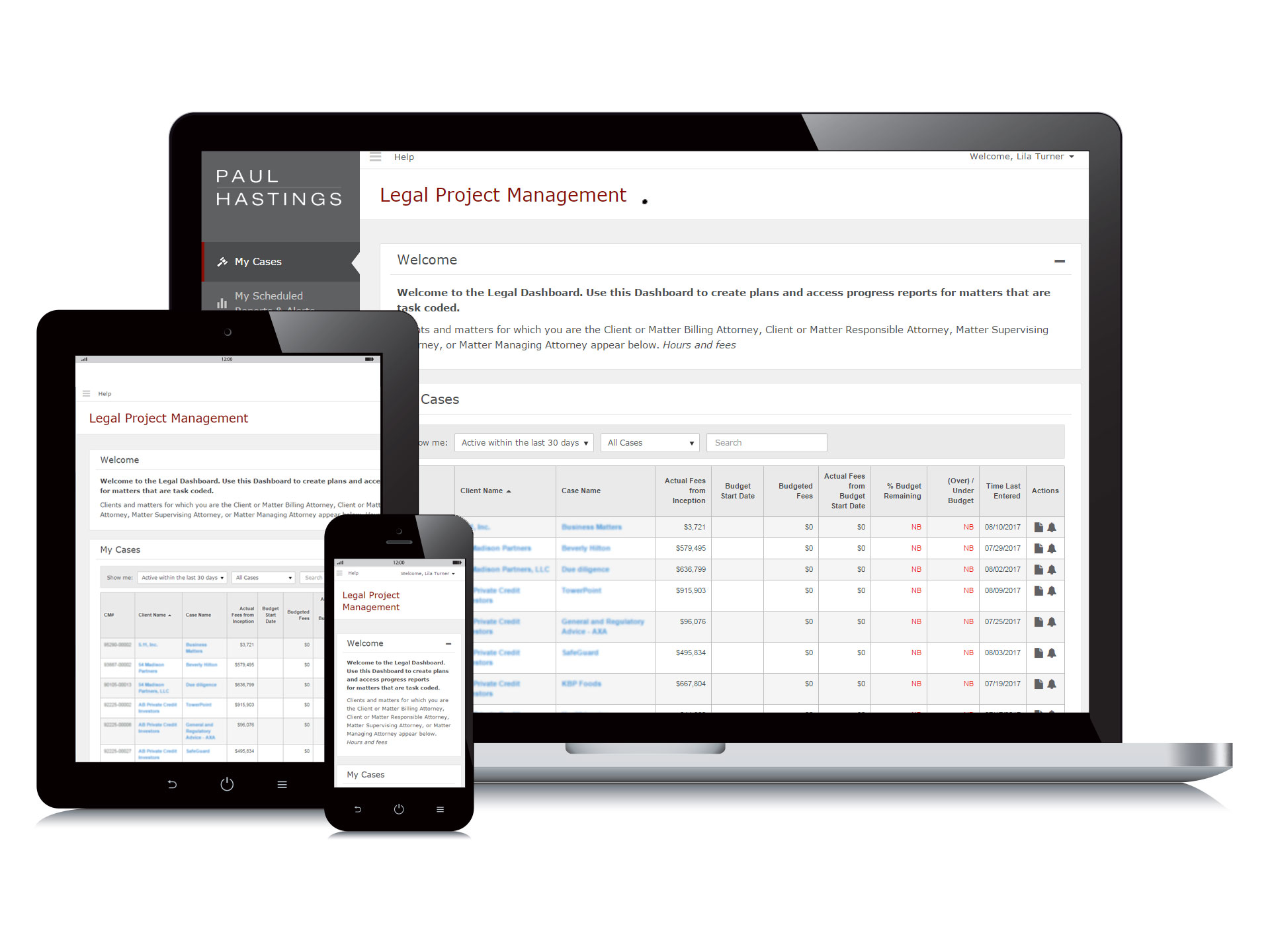
What is the project?
The Matter Management Dashboard allows attorneys to plan, budget, and monitor their legal matters, giving the law firm a competitive edge, as more and more clients request that law firms plan and budget for the services they provide.
Key goals
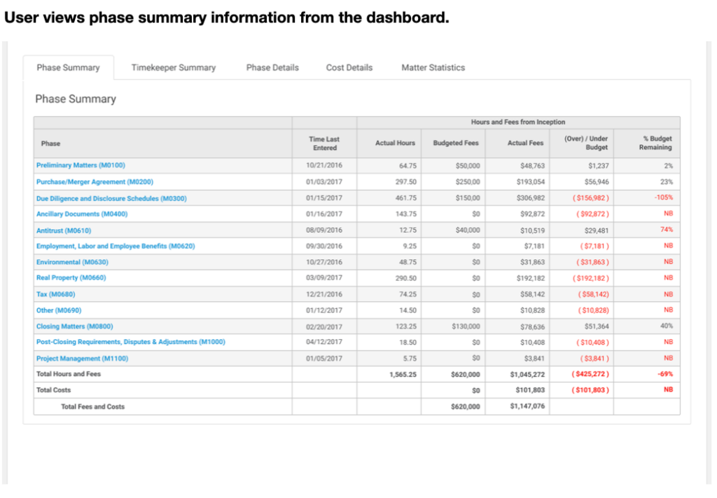
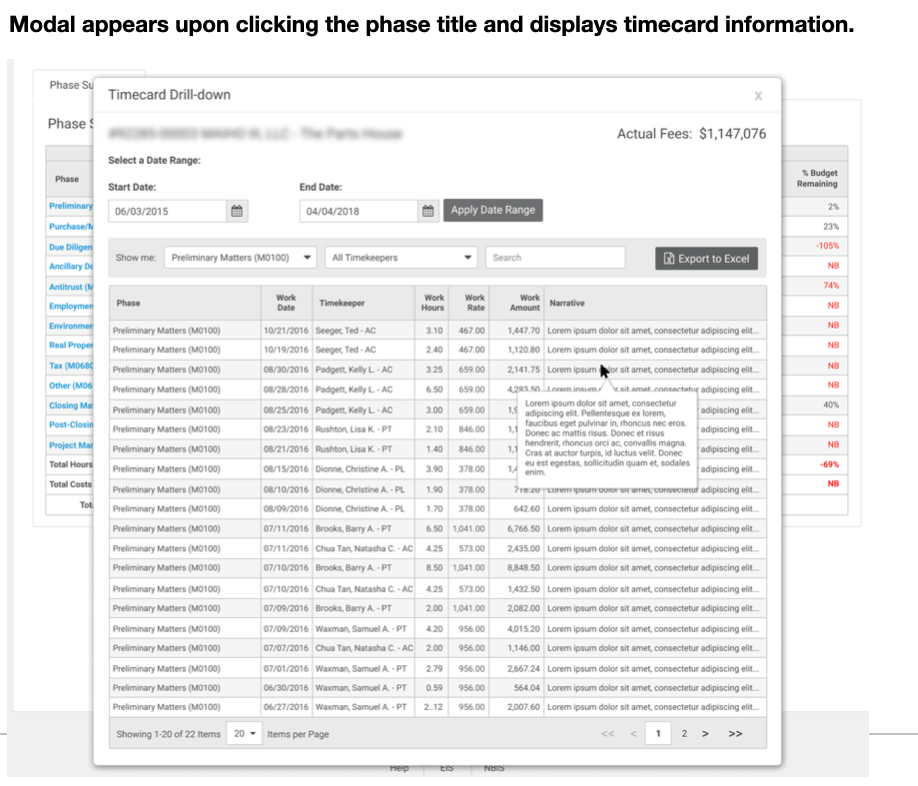
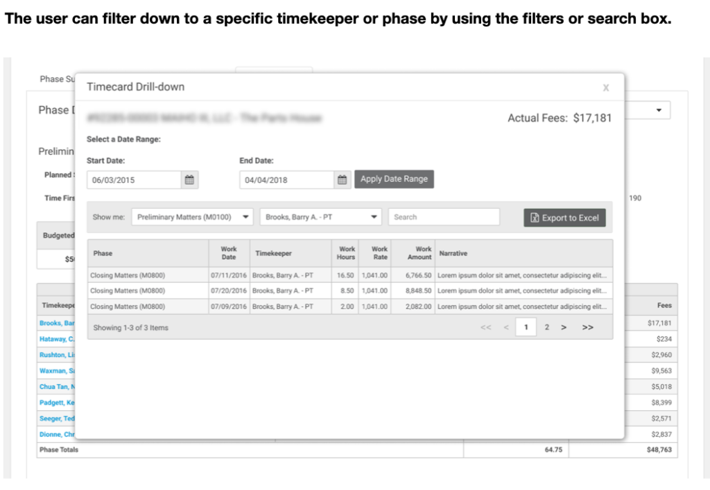
Design and build a feature that allows attorneys to easily obtain timecard information from the dashboard to detect and correct time entry errors quickly.
Attorneys were required to obtain timecard information through the firm’s finance department, which took up to 1-2 days to get a response.
My roles and responsibilities
- Experience design, visual design, and front-end web development.
- Personas, empathy mapping, job stories, task flows, and high-fidelity mockups.
- Style guide creation and maintenance.
- HTML5 and CSS3.
Team
The core team consisted of 1 business analyst, 3 back-end developers, and 1 UI/UX designer. We worked closely with 2 business stakeholders.
Duration
1 week of requirements gathering and research, and 1 week of design.
Work environment
All project team members one onsite in the Los Angeles office.
My process
Discovery
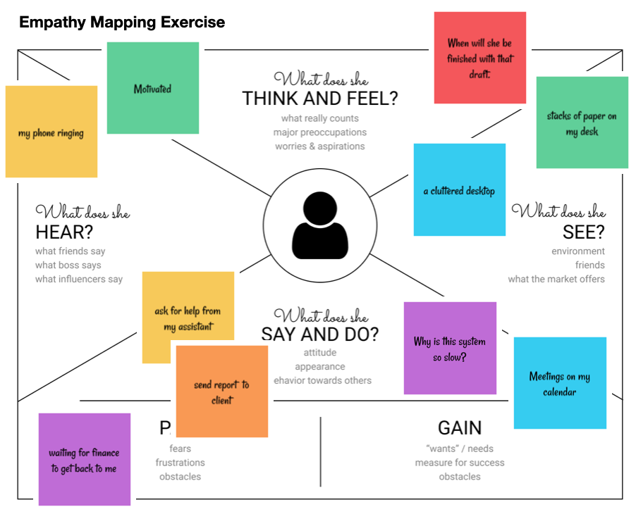
During earlier phases of designing and developing the product, I led the project team in an empathy mapping exercise to create empathy for the dashboard users.
Analyze
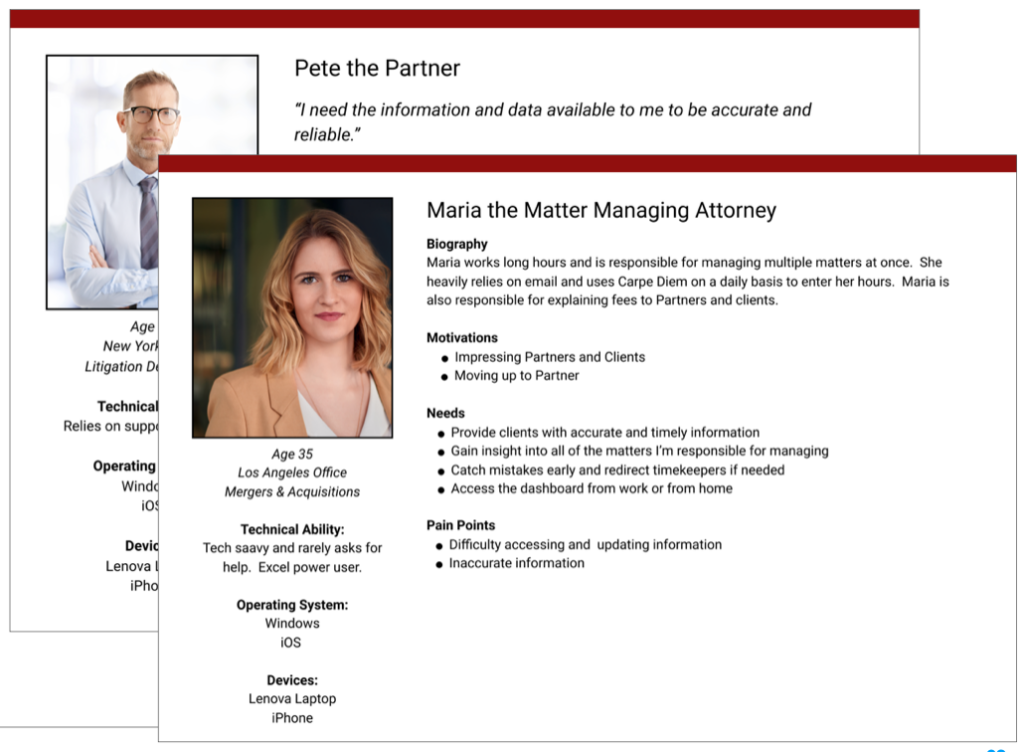
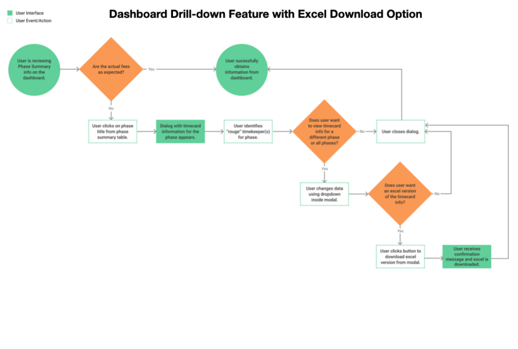
I used data collected from stakeholder interviews and the empathy mapping session to create personas. I also created job stories, and task flows to help our project team better understand how to design the user interface.
Design
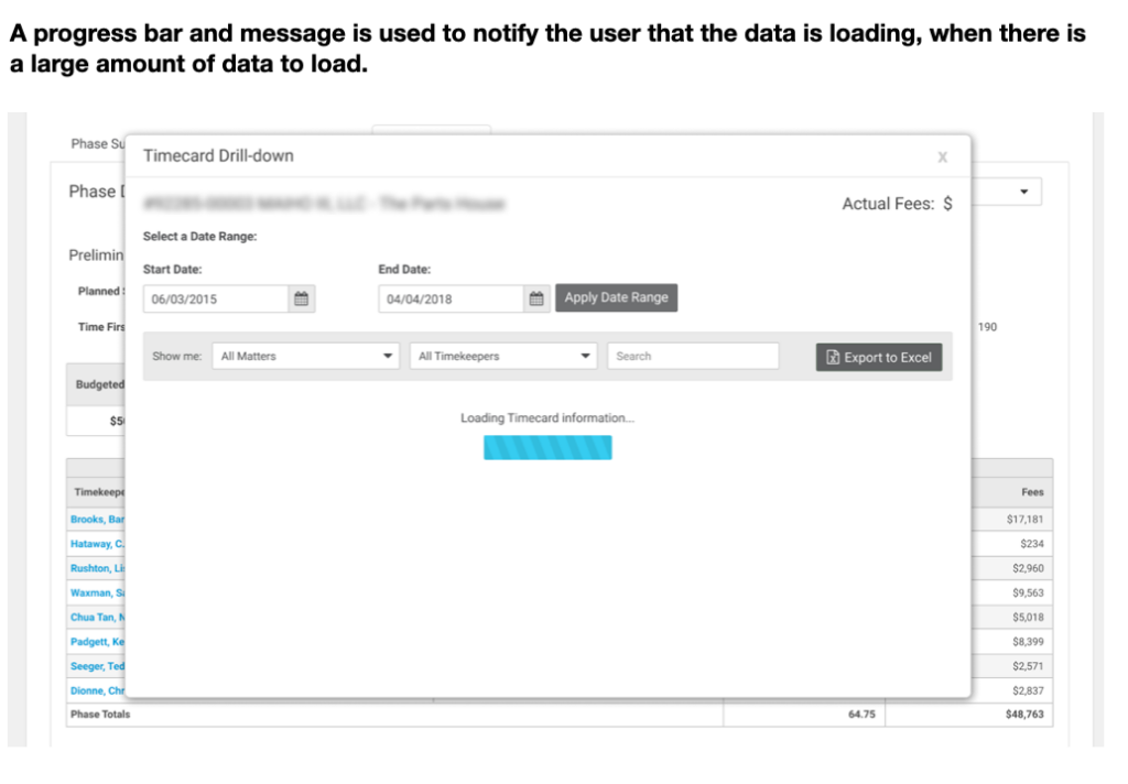
I created high-fidelity mockups based on the pattern library and style guide I previously created. Our product team preferred high-fidelity mockups to get a better sense of the user experience.
Results and lessons learned
Results
The timecard drill-down feature was successfully added to the dashboard, giving attorneys the ability to identify time entry errors and make corrections before sending bills to their clients.
Lessons learned
Had the project team allowed for more time for usability testing, I would’ve explored alternate formats for displaying the data. While users were accustomed to viewing financial information in tables, an alternate layout with more whitespace would likely make it easier to scan and read information and reduce the cognitive load.
